• Presentación Smart City y Geolocalización: Héctor García
  • Sample Page
  • ES
  • EN
  • Avda. de Grecia 8. 41012 Sevilla, España
  • |
  • www.geographica.gs

Data Analysis

Data analysis with Matplotlib

Mapping the worldwide night with Matplotlib

Posted at 15/03/2015 by Cayetano Benavent

These past few weeks I have been taking the most out of one of my favorite software libraries for data analysis: Matplotlib. This powefull open-source software library from python-based ecosystem, along with others like Numpy, Scipy, IPython, Pandas, Sympy, etc., is a core package in The Scipy Stack, the Scientific Computing Tools for Python (http://www.scipy.org/).

Although I have been working with Matplotlib for several years, a thorough study of its core has allowed me to slowly get to know their true potential.

Like a geographer, it couldn’t be otherwise Matplotlib toolkit most often used by me is Basemap, which I spent many hours plotting results before include them in a Geographic Information System (GIS). It is noteworthy the strength of Basemap is underpinned by two top quality libraries: PROJ4 and GEOS.

Even though Basemap runs inside Matplotlib, it is a solely library developed by Jeffrey S. Whitaker, a meteorologist from Earth System Research Laboratory – National Oceanic and Atmospheric Administration (NOAA).

It’s a fairy one to remember the importance of Jeffrey S. Whitaker in geoscientific computing world because he has given several very valuable tools to community, like Python binding to Unidata NetCDF C Library or Python bindings to main GRIB file decoders (NOAA and ECMWF).

You can find an example of my last works with Basemap in a tiny library I have developed around it, and I have called daynight2geojson. The aim of this little application is to get worldwide spatial distribution of night at specified date (must be UTC).

If it is not specified a date, this library computes night cover at current date (UTC, of course). When it has been retrieved all data, these are processed and stored in a GeoJSON file. This file could be load in any client capable to read this very simple format (currently most clients can handle this file format without any problem).

All processing are done with the help of Python GeoJSON library and Shapely, a Python library for manipulation and analysis of geometric objects in the Cartesian plane (this library works over GEOS). Output layer Coordinate Reference System  (CRS) is EPSG:4326.

For people who want to delve into the subject, all the mathematical background on which is builded the computation of worldwide night geometry are in Basemap solar module: GHA (Greenwich hour angle) computation, solar declination, etc.

Below are displayed some examples of calculations using the library daynight2geojson at different dates:

  •  Computations for January 15, 2015 at 12:00 UTC.

Matplotlib: Geographica

Link to computed GeoJSON.


  • Computations for January 15, 2015 at 18:00 UTC. (same day at different time).

Data analysis with Matplotlib

Link to computed GeoJSON


You can get the source on Github: https://github.com/GeographicaGS/daynight2geojson

Do you have an idea, comment or issue? You can contribute forking the project or opening an issue. You will be welcome.

See you soon!


GeoJSONmatplotlibPython
GEO_blog_cayetano
Posted at 15/03/2015 by
 Cayetano Benavent
GIS Analyst
SHARE
Posted in: GeoJSON, matplotlib, Python | Tagged: Data Analysis, geographica, Matplotlib

Geovisor for Climate Data Visualization

Global Climate Monitor: Data Analysis and Visualization to Forward Climate Knowledge

Posted at 30/06/2014 by Juan Pedro Pérez

See it at http://globalclimatemonitor.org/!

Data are all around. We got at the tips of our fingers more data than we can hopefully analyze in a consistent way. New ways and tools of analyzing huge amounts of data are readily available as Open Source technologic stacks. “Big Data” is a new buzzword now commonly linked to many scientific fields, and Earth Observation applications is not an exception.

The Climate Research Group from University of Seville has teamed up with Geographica to create an online geovisor for climate data visualization.

The British Atmosphere Data Centre (BADC) and the Climatic Research Unit (CRU) from the University of East Anglia compile and freely distribute climatic data coming from more than 4000 weather stations around the world, on a month-by-month basis and a 0.5×0.5 degree resolution. This huge dataset include data about cloud cover, diurnal temperature range, frost frecuency, precipitation, etc. The data series begins in 1901.

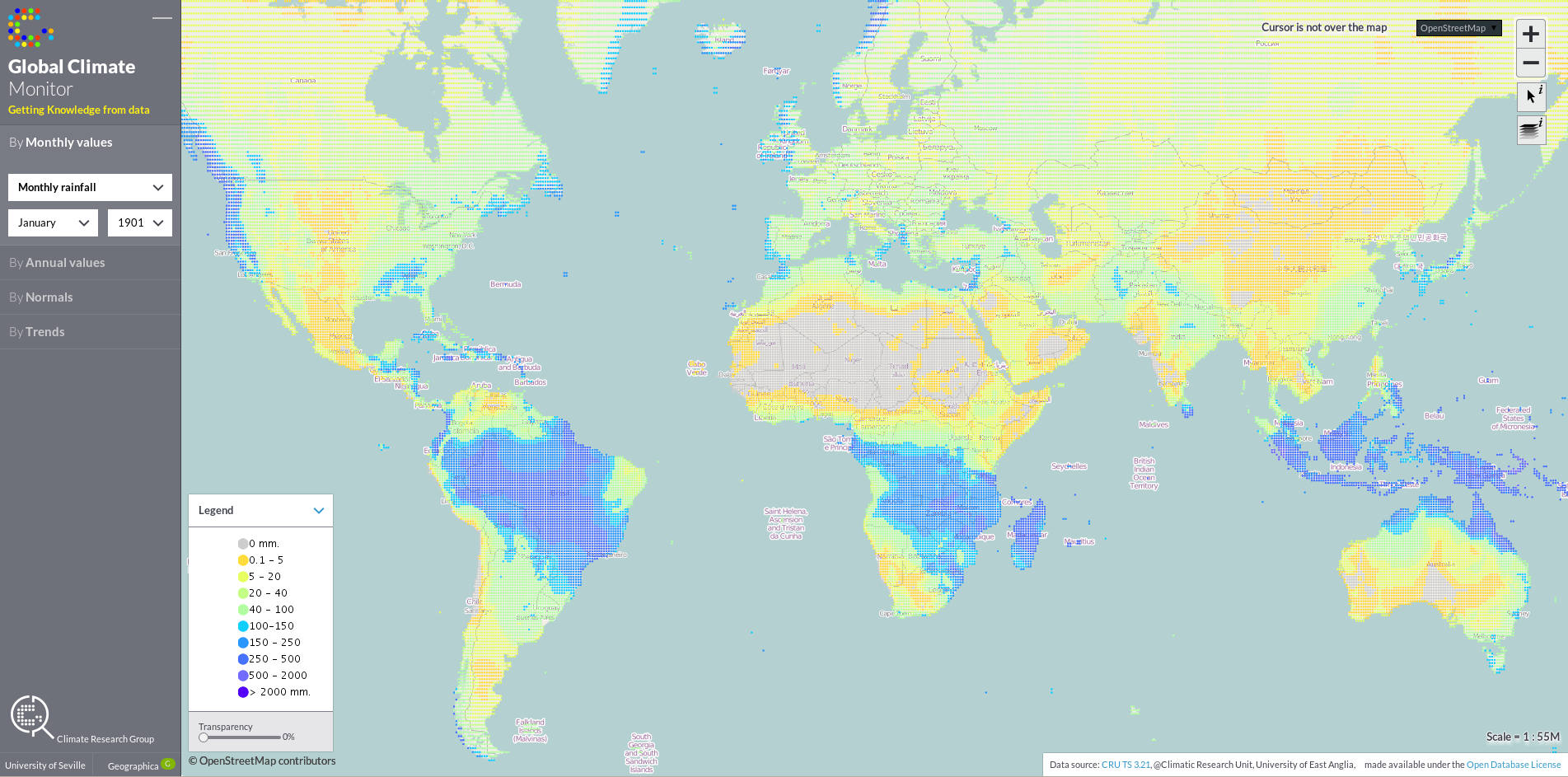
Global Climate Monitor - Monthly Rainfall - January 1901
Global Climate Monitor – Monthly Rainfall – January 1901. Note, along with the next image, the latitude movility of the intertropical convergence zone between summer and winter.
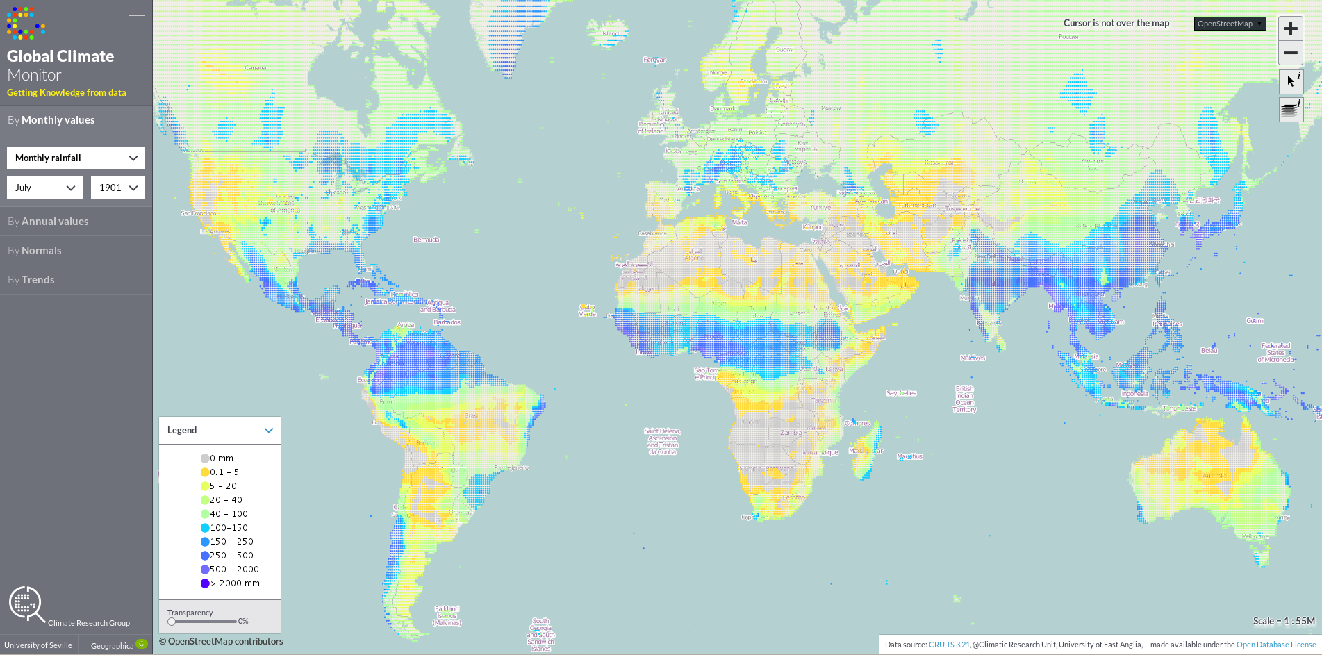
Global Climate Monitor - Monthly Rainfall - July 1901
Global Climate Monitor – Monthly Rainfall – July 1901. Note, along with the previous image, the latitude movility of the intertropical convergence zone between summer and winter.

This impressive data source was used by the Climate Research Group from the University of Seville to study drought effects and patterns and as a testbed for their droughts studies and indices.

Entering the dataset into the R statistical package (it is originally distributed as NetCDF), several analysis over the data series were performed: temperature (mean, minimum and maximum), potential evapotranspiration, and rainfall anomalies, both on a monthly and annual basis, normals calculations on a 30 years lapse, and trends.

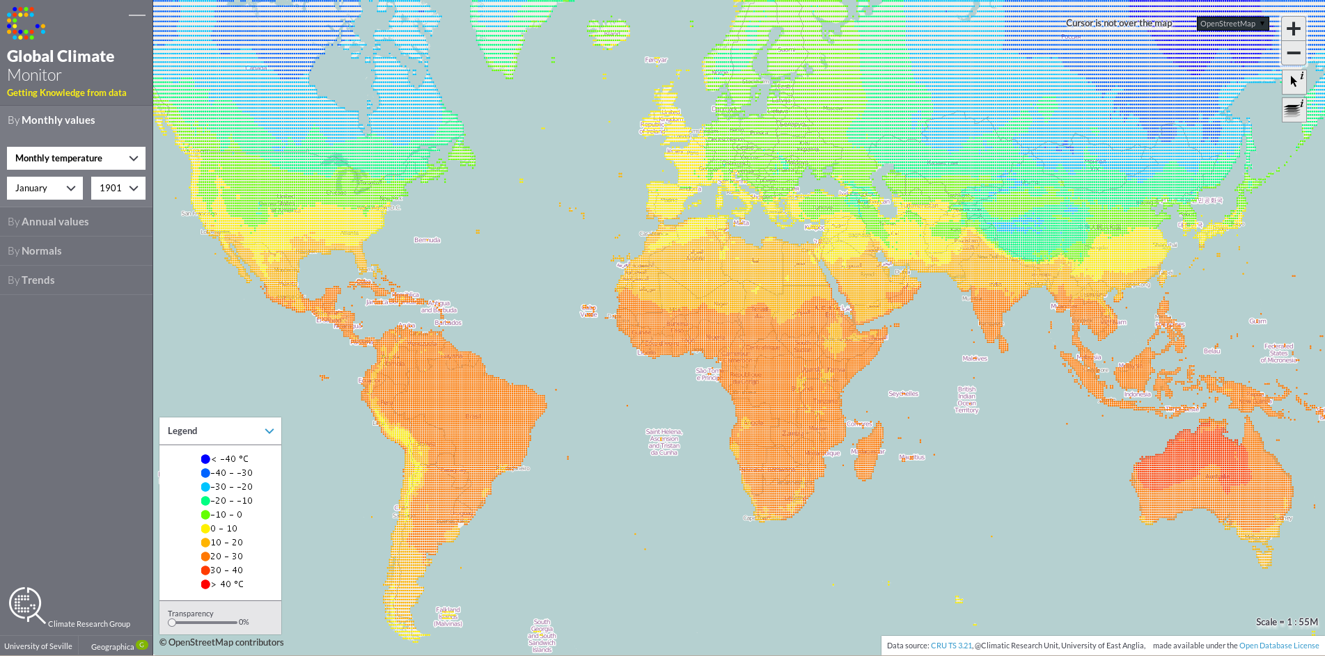
Global Climate Monitor - Monthly Temperature - January 1901
Global Climate Monitor – Monthly Temperature – January 1901
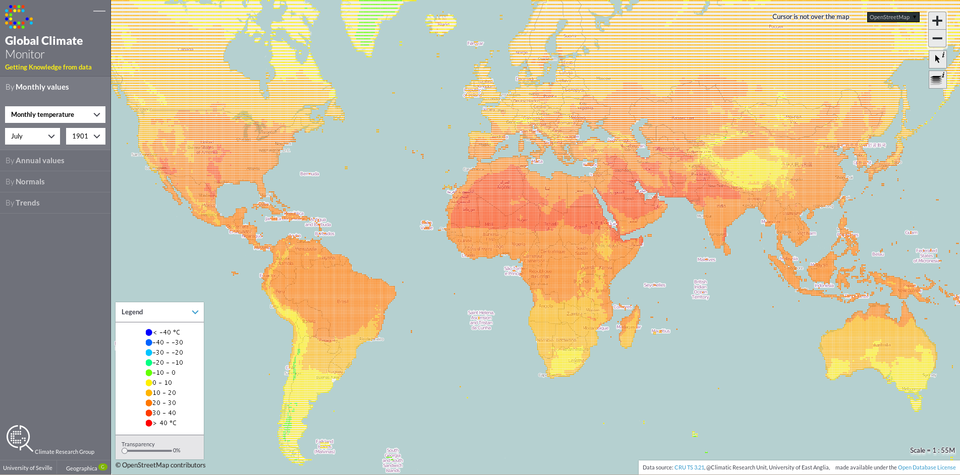
Global Climate Monitor - Monthly Temperature - July 1901
Global Climate Monitor – Monthly Temperature – July 1901

All this data was introduced into a PostGIS Relational Spatial Database, that builds on top the Open Source Relational Database PostgreSQL. This generates tables with more than 90 million records, which is a solid testimony of the suitability of PostgreSQL as a high performance geospatial database. Over this PostGIS, a GeoServer map server was deployed to retrieve variables in a selected time lapse from the database and serve them as interoperable tileable services.

Semiologically, points forming the 0.5×0.5 reticule the dataset conforms to where rendered in varying colors and slightly increasing size. This semiology provides a world covering, easily to read data definition, where climatic patterns can be promptly discovered. The frontend viewer is an OpenLayers HTML5 viewer development.

What’s Next?

Several paths are being considered for improving the system. Aside from the possibility of adding new climate variables and analysis over existing ones, technical improvements on the Open Source geospatial tech stack used are possible.

To improve speed, the PostGIS / GeoServer pair can be substituted by a MongoDB for storing tile point data structures that are directly rendered as vectors on the viewer. Also, a data streaming service can be used to stream point data to the viewer for making real-time animations of data along the time axis. As for semiology, new ways of representing data can be explored, like for example the making of isolines and isoareas.

Uncategorized
geographica2036-120x120
Posted at 30/06/2014 by
 Juan Pedro Pérez
Director Científico
SHARE
Posted in: Uncategorized | Tagged: Data Analysis, Data Visualization, geographica, Global Climate Monitor

© 2023 Geographica. Todos los derechos reservados.

  • English
  • Español